20 个超级实用的 CSS 技巧,帮助你成为更好的开发者
在开发项目中,修改输入占位符样式,多行文本溢出,隐藏滚动条,修改光标颜色,水平和垂直居中等等,这些都是我们非常熟悉的开发场景!前端开发者几乎每天都会和它们打交道,因此,我在这里给大家总结了20个超级实用的CSS技巧,一起来看看吧。
1.解决图片5px间距问题
你是否经常遇到图片底部多出5px间距的问题?不着急,这里有4种方法可以帮助你解决此问题。
解决方案 1:将 font-size: 0 设置为父元素
演示地址:https://codepen.io/qianlong/pen/VwrzoyE
具体实现代码如下:
HTML
<!DOCTYPE html>
<html lang="en">
<head>
  <meta charset="UTF-8">
  <meta http-equiv="X-UA-Compatible" content="IE=edge">
  <meta name="viewport" content="width=device-width, initial-scale=1.0">
  <title>image 5px spacing</title>
</head>
<body>
  <div class="img-container">
    <img src="https://cdn-images-1.medium.com/max/1600/0*MU3iBxNwssZWt6Tj" alt="">
  </div>
</body>
</html>
CSS
<!DOCTYPE html>
<html lang="en">
<head>
  <meta charset="UTF-8">
  <meta http-equiv="X-UA-Compatible" content="IE=edge">
  <meta name="viewport" content="width=device-width, initial-scale=1.0">
  <title>image 5px spacing</title>
</head>
<body>
  <div class="img-container">
    <img src="https://cdn-images-1.medium.com/max/1600/0*MU3iBxNwssZWt6Tj" alt="">
  </div>
</body>
</html>
解决方案 2:将 display: block 设置为 img演示地址:https://codepen.io/qianlong/pen/eYeGONM具体实现代码如下:
HTML
<!DOCTYPE html>
<html lang="en">
<head>
  <meta charset="UTF-8">
  <meta http-equiv="X-UA-Compatible" content="IE=edge">
  <meta name="viewport" content="width=device-width, initial-scale=1.0">
  <title>image 5px spacing</title>
</head>
<body>
  <div class="img-container">
    <img src="https://cdn-images-1.medium.com/max/1600/0*MU3iBxNwssZWt6Tj" alt="">
  </div>
</body>
</html>
CSS
   html,body{
      margin: 0;
      padding: 0;
    }

    .img-container{
      background-color: lightblue;
    }

    img{
      width: 100%;
      /* Key Style */
      display: block;
    }
解决方案 3:将 vertical-align: bottom 设置为 img
演示地址:https://codepen.io/qianlong/pen/jOaGNWw
具体实现代码如下:
HTML
<!DOCTYPE html>
<html lang="en">
<head>
  <meta charset="UTF-8">
  <meta http-equiv="X-UA-Compatible" content="IE=edge">
  <meta name="viewport" content="width=device-width, initial-scale=1.0">
  <title>image 5px spacing</title>
</head>
<body>
  <div class="img-container">
    <img src="https://cdn-images-1.medium.com/max/1600/0*MU3iBxNwssZWt6Tj" alt="">
  </div>
</body>
</html>
CSS
    html,body{
      margin: 0;
      padding: 0;
    }

    .img-container{
      background-color: lightblue;
    }

    img{
      width: 100%;
      /* Key Style */
      vertical-align: bottom;
    }
方案四:给父元素设置line-height: 5px
演示地址:https://codepen.io/qianlong/pen/PoOJYzN
具体实现代码如下:
HTML
<!DOCTYPE html>
<html lang="en">
<head>
  <meta charset="UTF-8">
  <meta http-equiv="X-UA-Compatible" content="IE=edge">
  <meta name="viewport" content="width=device-width, initial-scale=1.0">
  <title>image 5px spacing</title>
</head>
<body>
  <div class="img-container">
    <img src="https://cdn-images-1.medium.com/max/1600/0*MU3iBxNwssZWt6Tj" alt="">
  </div>
</body>
</html>
CSS
   html,body{
      margin: 0;
      padding: 0;
    }

    .img-container{
      background-color: lightblue;
      /* Key Style */
      line-height: 5px;
    }

    img{
      width: 100%;
    }
2.元素高度与窗口相同
演示地址:https://codepen.io/qianlong/pen/xxPXKXe
如何让元素和窗口一样高?示例代码如下:
   html,body{
      margin: 0;
      padding: 0;
    }

    .img-container{
      background-color: lightblue;
      /* Key Style */
      line-height: 5px;
    }

    img{
      width: 100%;
    }
* {
margin: 0;
padding: 0;
}
.child {
width: 100%;
/* Key Style */
height: 100vh;
background-image: linear-gradient(180deg, #2af598 0%, #009efd 100%);
}
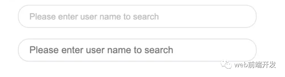
3.修改输入占位符样式
演示地址:https://codepen.io/qianlong/pen/JjOrPOq
第一个修改了,第二个没有修改。
<input type="text" class="placehoder-custom" placeholder="Please enter user name to search">
<input type="text" placeholder="Please enter user name to search">
* {
  margin: 0;
  padding: 0;
}

input {
  width: 300px;
  height: 30px;
  border: none;
  outline: none;
  display: block;
  margin: 15px;
  border: solid 1px #dee0e9;
  padding: 0 15px;
  border-radius: 15px;
}
/* Key Style */
.placehoder-custom::-webkit-input-placeholder {
  color: #babbc1;
  font-size: 12px;
}
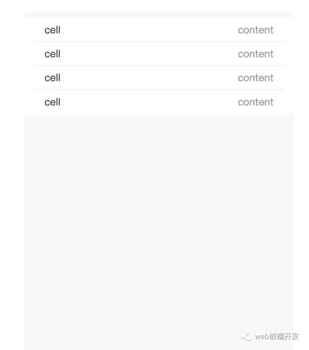
4. 使用“:not”选择器
演示地址:https://codepen.io/qianlong/pen/QWOqLQO
除了最后一个元素之外的所有元素都需要一些样式,使用 not 选择器会非常容易。
如下图:最后一个元素没有底边框。
<ul>
  <li>
    <span>cell</span>
    <span>content</span>
  </li>
  <li>
    <span>cell</span>
    <span>content</span>
  </li>
  <li>
    <span>cell</span>
    <span>content</span>
  </li>
  <li>
    <span>cell</span>
    <span>content</span>
  </li>
</ul>
<ul>
  <li>
    <span>cell</span>
    <span>content</span>
  </li>
  <li>
    <span>cell</span>
    <span>content</span>
  </li>
  <li>
    <span>cell</span>
    <span>content</span>
  </li>
  <li>
    <span>cell</span>
    <span>content</span>
  </li>
</ul>
5.使用flex布局智能固定一个元素在底部
演示地址:https://codepen.io/qianlong/pen/ZEaXzxM
当内容不够时,按钮应该在页面底部。当有足够的内容时,按钮应该跟随内容。当你遇到类似问题时,使用flex实现智能布局!
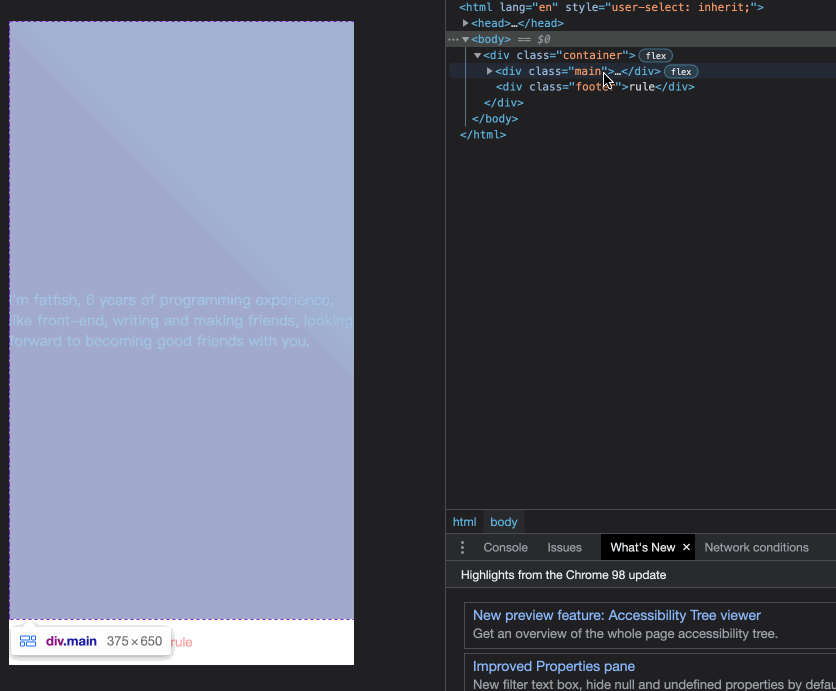
代码如下:
<div class="container">
  <div class="main">I'm fatfish, 6 years of programming experience, like front-end, writing
    and making friends,looking forward to becoming good friends with you.</div>
  <div class="footer">rule</div>
</div>
* {
  margin: 0;
  padding: 0;
}

.container {
  height: 100vh;
  /* Key Style */
  display: flex;
  flex-direction: column;
  justify-content: space-between;
}

.main {
  /* Key Style */
  flex: 1;
  background-image: linear-gradient(
    45deg,
    #ff9a9e 0%,
    #fad0c4 99%,
    #fad0c4 100%
  );
  display: flex;
  align-items: center;
  justify-content: center;
  color: #fff;
}

.footer {
  padding: 15px 0;
  text-align: center;
  color: #ff9a9e;
  font-size: 14px;
}
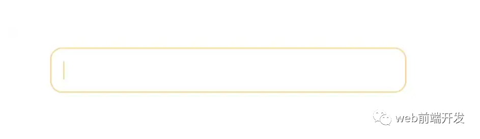
6.使用“caret-color”修改光标颜色
演示地址:https://codepen.io/qianlong/pen/YzErKvy
有时需要修改光标的颜色。现在是插入符号颜色显示时间。
<input type="text" class="caret-color" />
* {
margin: 0;
padding: 0;
}
body {
display: flex;
justify-content: center;
}
.caret-color {
width: 300px;
padding: 10px;
margin-top: 20px;
border-radius: 10px;
border: solid 1px #ffd476;
box-sizing: border-box;
background-color: transparent;
outline: none;
color: #ffd476;
font-size: 14px;
/* Key Style */
caret-color: #ffd476;
}
.caret-color::-webkit-input-placeholder {
color: #4f4c5f;
font-size: 14px;
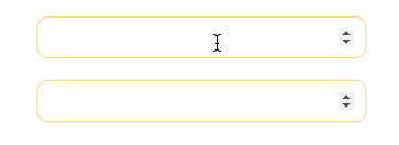
}7.去掉type=”number”末尾的箭头
演示地址:https://codepen.io/qianlong/pen/OJOxLrg
默认情况下,input type = “number”的末尾会出现一个小箭头,但有时我们需要将其去掉。我们应该做什么?
如下图:第二个去掉了,第一个没有。

<input type="number" />
<input type="number" class="no-arrow" />
* {
  margin: 0;
  padding: 0;
}

body {
  display: flex;
  justify-content: center;
  align-items: center;
  flex-direction: column;
}

input {
  width: 300px;
  padding: 10px;
  margin-top: 20px;
  border-radius: 10px;
  border: solid 1px #ffd476;
  box-sizing: border-box;
  background-color: transparent;
  outline: none;
  color: #ffd476;
  font-size: 14px;
  caret-color: #ffd476;
  display: block;
}

input::-webkit-input-placeholder {
  color: #4f4c5f;
  font-size: 14px;
}
/* Key Style */
.no-arrow::-webkit-outer-spin-button,
.no-arrow::-webkit-inner-spin-button {
  -webkit-appearance: none;
}
8.“outline:none”去掉输入状态行
演示地址:https://codepen.io/qianlong/pen/YzErzKG
当输入框被选中时,默认会有一个蓝色的状态行,可以使用 outline: none 去掉。
如下图:第二个输入框去掉了,第一个没有。
<input type="number" />
<input type="number" class="no-outline" />
* {
  margin: 0;
  padding: 0;
}

body {
  display: flex;
  justify-content: center;
  align-items: center;
  flex-direction: column;
}

input {
  width: 300px;
  padding: 10px;
  margin-top: 20px;
  border-radius: 10px;
  border: solid 1px #ffd476;
  box-sizing: border-box;
  background-color: transparent;
  color: #ffd476;
  font-size: 14px;
  caret-color: #ffd476;
  display: block;
}
/* Key Style */

.no-outline {
  outline: none;
}
9.解决iOS滚动条卡住的问题
在苹果手机上,经常会出现滚动时元素卡住的情况。这个时候只有一行CSS会支持弹性滚动。
body,html{
  -webkit-overflow-scrolling: touch;
}
10.画三角形
演示地址:https://codepen.io/qianlong/pen/rNYGNRe
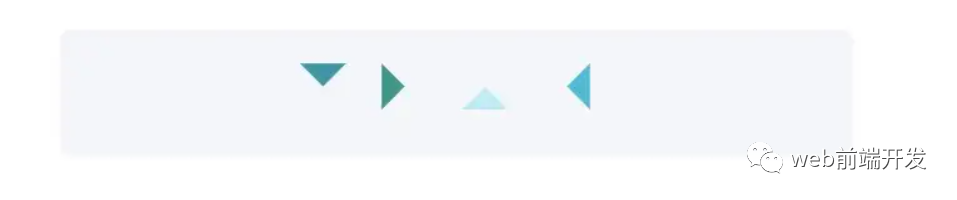
<div class="box">
  <div class="box-inner">
    <div class="triangle bottom"></div>
    <div class="triangle right"></div>
    <div class="triangle top"></div>
    <div class="triangle left"></div>
  </div>
</div>
* {
  margin: 0;
  padding: 0;
}

body {
  padding: 15px;
}

.box {
  padding: 15px;
  background-color: #f5f6f9;
  border-radius: 6px;
  display: flex;
  align-items: center;
  justify-content: center;
}

.triangle {
  display: inline-block;
  margin-right: 10px;
  /* Base Style */
  border: solid 10px transparent;
}
/*bottom*/
.triangle.bottom {
  border-top-color: #0097a7;
}
/*top*/
.triangle.top {
  border-bottom-color: #b2ebf2;
}
/*left*/
.triangle.left {
  border-right-color: #00bcd4;
}
/*right*/
.triangle.right {
  border-left-color: #009688;
}
11.画小箭头
演示地址:https://codepen.io/qianlong/pen/ZEaXEEP

<div class="box">
  <div class="box-inner">
    <div class="arrow bottom"></div>
    <div class="arrow top"></div>
    <div class="arrow right"></div>
    <div class="arrow left"></div>
  </div>
</div>
* {
  margin: 0;
  padding: 0;
}

body {
  padding: 15px;
}

.box {
  padding: 15px;
  background-color: #ffffff;
  border-radius: 6px;
  display: flex;
  align-items: center;
  justify-content: center;
}

.arrow {
  display: inline-block;
  margin-right: 10px;
  width: 0;
  height: 0;
  /* Base Style */
  border: 16px solid;
  border-color: transparent #cddc39 transparent transparent;
  position: relative;
}

.arrow::after {
  content: "";
  position: absolute;
  right: -20px;
  top: -16px;
  border: 16px solid;
  border-color: transparent #fff transparent transparent;
}
/*bottom*/
.arrow.bottom {
  transform: rotate(270deg);
}
/*top*/
.arrow.top {
  transform: rotate(90deg);
}
/*left*/
.arrow.left {
  transform: rotate(180deg);
}
/*right*/
.arrow.right {
  transform: rotate(0deg);
}
12.图像适合窗口大小
演示地址:https://codepen.io/qianlong/pen/PoOJoPO
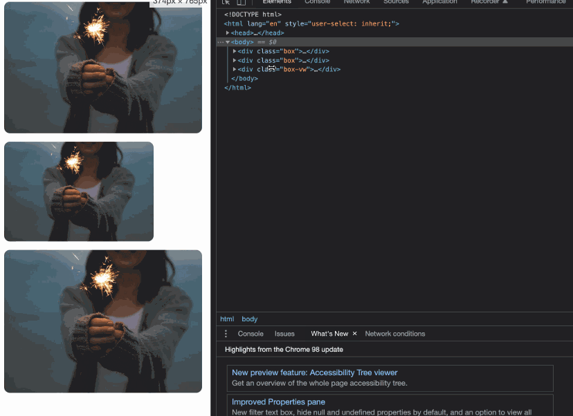
vw vs padding
<div class="box">
  <div class="img-container">
    <img src="https://cdn-images-1.medium.com/max/1600/0*tuDPftoIhupd-qx-.jpg" alt="">
  </div>
</div>

<div class="box">
  <div class="img-container">
    <img src="https://cdn-images-1.medium.com/max/1600/0*tuDPftoIhupd-qx-.jpg" alt="">
  </div>
</div>

<div class="box-vw">
  <div class="img-container">
    <img src="https://cdn-images-1.medium.com/max/1600/0*tuDPftoIhupd-qx-.jpg" alt="">
  </div>
</div>
* {
  margin: 0;
  padding: 0;
}

body {
  padding: 15px;
}

.box,
.box-vw {
  background-color: #010102;
  border-radius: 10px;
  overflow: hidden;
  margin-bottom: 15px;
}

.box:nth-of-type(2) {
  width: 260px;
}
/* vw */
.box-vw .img-container {
  width: 100vw;
  height: 66.620879vw;
  padding-bottom: inherit;
}
/* padding */
.img-container {
  width: 100%;
  height: 0;
  /* Aspect ratio of picture*/
  padding-bottom: 66.620879%;
}

img {
  width: 100%;
}
13.隐藏滚动条
演示地址:https://codepen.io/qianlong/pen/yLPzLeZ
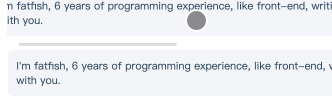
第一个滚动条可见,第二个隐藏。
这意味着容器可以滚动,但是滚动条是隐藏的,就好像它是透明的一样。
<div class="box">
  <div>
    I'm fatfish, 6 years of programming experience, like front-end, writing
    and making friends, looking forward to becoming good friends with you.
  </div>
</div>
<div class="box box-hide-scrollbar">
  <div>
    I'm fatfish, 6 years of programming experience, like front-end, writing
    and making friends, looking forward to becoming good friends with you.
  </div>
</div>
* {
margin: 0;
padding: 0;
}
body {
padding: 15px;
color: #324b64;
}
.box {
width: 375px;
overflow: scroll;
}
/* Key Style */
.box-hide-scrollbar::-webkit-scrollbar {
display: none; /* Chrome Safari */
}
.box > div {
margin-bottom: 15px;
padding: 10px;
background-color: #f5f6f9;
border-radius: 6px;
font-size: 12px;
width: 750px;
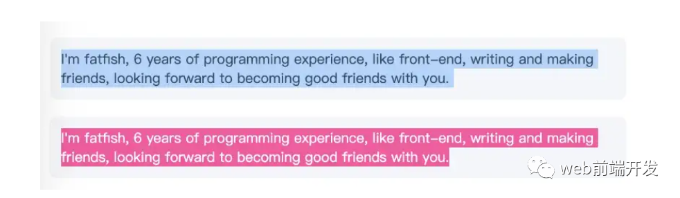
}14.自定义选中的文字样式
演示地址:https://codepen.io/qianlong/pen/jOaGOVQ
<div class="box">
  <p class="box-default">
    I'm fatfish, 6 years of programming experience, like front-end, writing
    and making friends, looking forward to becoming good friends with you.
  </p>
  <p class="box-custom">
    I'm fatfish, 6 years of programming experience, like front-end, writing
    and making friends, looking forward to becoming good friends with you.
  </p>
</div>
* {
margin: 0;
padding: 0;
}
body {
padding: 15px;
color: #324b64;
}
.box > p {
padding: 10px;
background-color: #f5f6f9;
border-radius: 6px;
font-size: 12px;
margin-bottom: 15px;
}
/* Key Style */
.box-custom::selection {
color: #ffffff;
background-color: #ff4c9f;
}15.不允许选择文本
演示地址:https://codepen.io/qianlong/pen/rNYGNyB
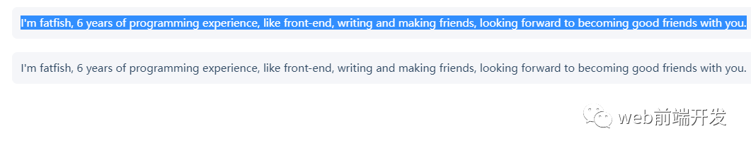
第一个内容可以选,第二个不可以选中了。
<div class="box">
  <p> I'm fatfish, 6 years of programming experience, like front-end, writing
    and making friends, looking forward to becoming good friends with you.</p>
  <p> I'm fatfish, 6 years of programming experience, like front-end, writing
    and making friends, looking forward to becoming good friends with you.</p>
</div>
* {
  margin: 0;
  padding: 0;
}

body {
  padding: 15px;
  color: #324b64;
}

.box p {
  margin-bottom: 15px;
  padding: 10px;
  background-color: #f5f6f9;
  border-radius: 6px;
  font-size: 12px;
}
/* Key Style */
.box p:last-child {
  user-select: none;
}
16. 水平和垂直居中元素
演示地址:https://codepen.io/qianlong/pen/VwrMwWb
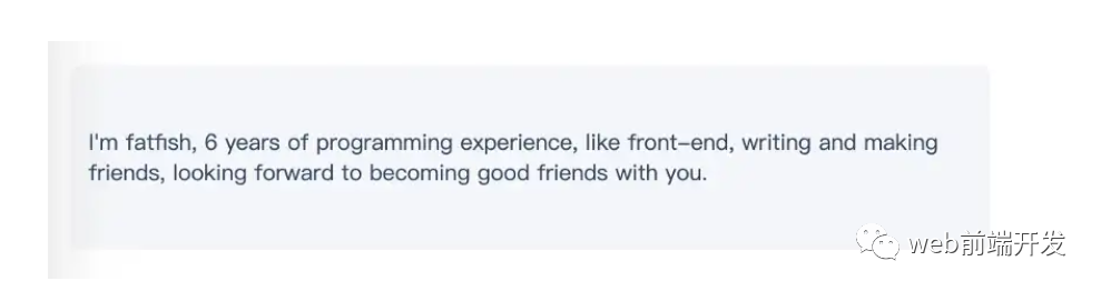
<div class="parent">
  <p class="child">I'm fatfish, 6 years of programming experience, like front-end, writing
    and making friends, looking forward to becoming good friends with you.</p>
</div>
<div class="parent">
<p class="child">I'm fatfish, 6 years of programming experience, like front-end, writing
and making friends, looking forward to becoming good friends with you.</p>
</div>17.单行文字溢出时显示省略号
演示地址:https://codepen.io/qianlong/pen/vYWeYJJ
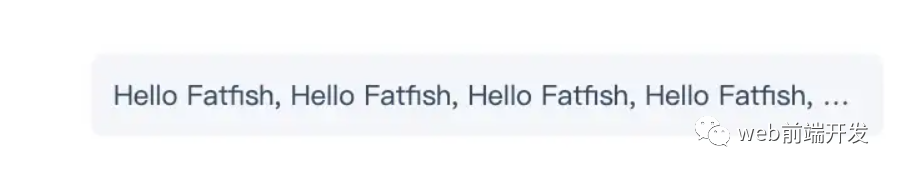
<div class="box">
  <p class="one-line-ellipsis">Hello Fatfish, Hello Fatfish, Hello Fatfish, Hello Fatfish, Hello Fatfish, Hello Fatfish,Hello Fatfish, Hello Fatfish, Hello Fatfish, Hello Fatfish, Hello Fatfish, Hello Fatfish</p>
</div>
* {
  margin: 0;
  padding: 0;
}

body {
  padding: 15px;
  color: #324b64;
}

.box {
  padding: 10px;
  background-color: #f5f6f9;
  border-radius: 6px;
  font-size: 12px;
}

.one-line-ellipsis {
  /* Key Style */
  overflow: hidden;
  white-space: nowrap;
  text-overflow: ellipsis;
  max-width: 375px;
}
18.多行文字溢出时显示省略号
演示地址:https://codepen.io/qianlong/pen/ZEaXEJg
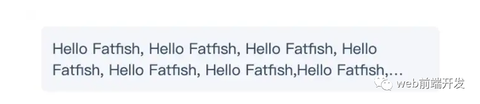
<div class="box">
  <p class="more-line-ellipsis">Hello Fatfish, Hello Fatfish, Hello Fatfish, Hello Fatfish, Hello Fatfish, Hello Fatfish,Hello Fatfish, Hello Fatfish, Hello Fatfish, Hello Fatfish, Hello Fatfish, Hello Fatfish</p>
</div>
* {
  margin: 0;
  padding: 0;
}

body {
  padding: 15px;
  color: #324b64;
}

.box {
  max-width: 375px;
  padding: 10px;
  background-color: #f5f6f9;
  border-radius: 6px;
  font-size: 13px;
}

.more-line-ellipsis {
  overflow: hidden;
  text-overflow: ellipsis;

  display: -webkit-box;
  /* set n lines, including 1 */
  -webkit-line-clamp: 2;
  -webkit-box-orient: vertical;
}
19.清除浮动
演示地址:https://codepen.io/qianlong/pen/dyZVyZW
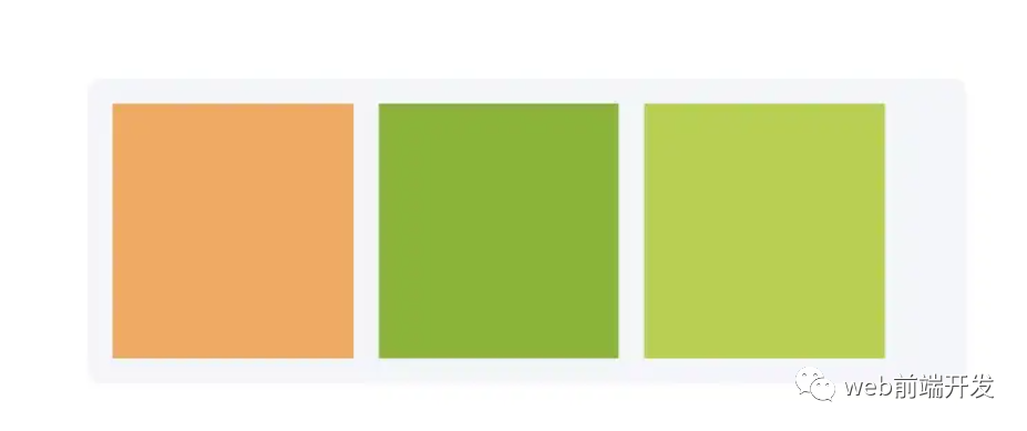
这是一种老式的布局方式,现在大部分移动端都不用了。
如下图,外层的高度没有塌陷,这就是为什么要使用clearfix类。
<div class="box">
  <p class="more-line-ellipsis">Hello Fatfish, Hello Fatfish, Hello Fatfish, Hello Fatfish, Hello Fatfish, Hello Fatfish,Hello Fatfish, Hello Fatfish, Hello Fatfish, Hello Fatfish, Hello Fatfish, Hello Fatfish</p>
</div>
* {
  margin: 0;
  padding: 0;
}

body {
  padding: 15px;
  color: #324b64;
}

.box {
  max-width: 375px;
  padding: 10px;
  background-color: #f5f6f9;
  border-radius: 6px;
  font-size: 13px;
}

.more-line-ellipsis {
  overflow: hidden;
  text-overflow: ellipsis;

  display: -webkit-box;
  /* set n lines, including 1 */
  -webkit-line-clamp: 2;
  -webkit-box-orient: vertical;
}
20.使用“filter:grayscale(1)”使页面处于灰色模式
body{
  filter: grayscale(1);
}
一行代码将使页面处于灰色模式,这功能也很实用的,国内最近一周的各大平台,基本都是这个灰色模式,至于原因嘛,大家都知道了,这里就不说了。
这些都是灰色模式,后期如果我们想要恢复到原来的正常模式,我们只需要在CSS里将filter: grayscale(1);这行代码注释掉即可。
写在最后
到这里,我今天所要与你分享的20个关于CSS的实用技巧就结束了,希望这些技巧能帮助到你,如果你觉得有用的话,请记得点赞我,关注我,并将这篇文章分享给你的朋友,也许能够帮助到他。
最后,感谢你的阅读,同时,也期待您的关注,从而阅读更多优质内容。